Showing posts with label statistics. Show all posts

Wednesday, July 22, 2009

Pandemic Perspective

The Swine Flu outbreak/pandemic/scare (pick depending on hysteria level) is all the rage at the moment. The current state of infections and deaths due to this strain of flu is available here. I thought that it would be enlightening to have a quick look at the data and see what is going on.

The Data
Let's have a look at the data for 6 countries:- Australia, Canada, Mexico, Spain, UK and US. The data data shows the situation as of the 17th of July, 2009.
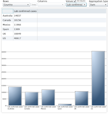


We can clearly see that the US has a very large number of confirmed cases. This is perhaps not the best metric since the US has a large, well connected (roads, air-travel and rail) population. More rural countries with less inter-city connectivity (eg. Spain) would probably see the number of cases be smaller.

A normalised infection rate will give us a better handle on the real extent of the spread of the virus.
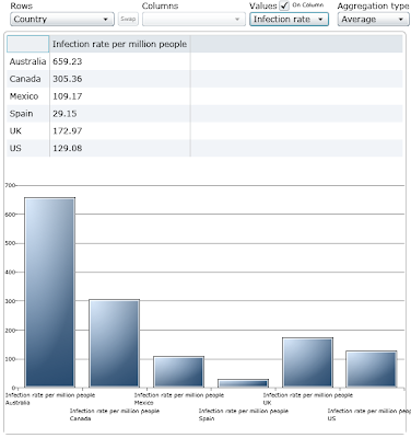

Of course, the infection rate will change over time. Smaller populations are likely to achieve their maximum infection rate sooner than larger ones. Perhaps this is a factor in explaining the differences between, say, Australia (21,855,000) and the UK (61,612,300).

As unpleasant as it is to suffer from flu symptoms, what we're really afraid of is dying. So let's have a look at the deaths per million population in these countries.
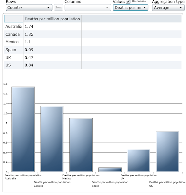
Unfortunately, what we see above still has some time dependant factor to it. As the number of cases increases then so to will the number of deaths. The above method doesn't help us to compare the situation across countries.

What we should be measuring is the number of infections that lead to death. Although this will still be somewhat dependant on the sample size it will at least give us a first order summary of what the infection-to-death cases look like as well as some comparison between the countries. We are assuming that each country has the same strain of the virus so that a given equivalent person in any of the countries will have the same mortality rate due to the virus. Extrinsic factors such as accessibility to health care level and general health of the population will also affect the results this is as good a high level overview as any other.

So should I panic!?

As ever, this isn't going to be much of a conclusion. Panic is a very personal reaction. In the US seasonal flu accounts for over 100 deaths per million of population. As you can see above (3rd diagram down), swine flu is currently at 0.84 deaths per million of population. I couldn't find any data on the infection-to-death rate for seasonal flu due to the fact that every web search serves up swine flu data. I'll just add it to the other causes of death that I'm not worried about.

Some more perspective:- Here in Spain, suicide accounts for 160 deaths-per-million population... and I'm not planning on catching that either!

Shameless plug:- All images diagrams were created using the DatalightProject's online statistics tool.

Tuesday, July 14, 2009

Sugar Daddy

My wife is in the process of building our first manzanoling. I was tempted to start with "My wife and I are in the process..." but my input to the creation process was over quite a while ago...

Before my wife was diagnosed with Gestational Diabetes I didn't even know that it existed (my bad!). Depending on the severity it can be more or less of a problem. The hospital provided us with small machine to measure my wife's blood sugar before and after meals. My wife*, being the iron willed obsessive that she is, took it upon herself to record the values and try different things to see if she could keep the sugar under control.

98 meals in and I decided to load up the data in the DataLightProject app. I had a pretty good qualitative handle on how things were going but I hadn't really been following the numbers that closely.

The diagram represents data before all meals (breakfast, lunch, dinner). We already knew that before eating her blood sugar values were generally within the normal range. The thing to keep an eye on is after eating.

The average value doesn't look too bad, but the Max value of 202 mg/100ml points to the fact that all is not as it should be.

Some quick application of filtering by food type and we get some idea of what foods are to blame. Some things were no surprise:- Orange juice (average 202 mg/100ml) and All-Bran (average 163 mg/100ml) were leaders in causing higher blood sugar. But toast (average 152 mg/100ml) for breakfast was a surprisingly bad thing too!

The most surprising effect on post meal blood sugar came when considering exercise. Now given that my wife is pregnant, the kind of exercise that she can do is pretty light. Even so this has a dramatic effect:

A 20 minute walk after breakfast makes a real difference. The blood sugar measurements after breakfast are consistently higher, so being able to get that under control was a real bonus. I'm not sure why exercise has a greater effect following dinner, but it's definitely real.

With any luck the diabetes will stop once the baby is born. This run-in with diabetes has really made us think about what it must be like to live with this condition throughout your whole life. Of course there are treatments but diabetes has a lot of day to day overhead. Most of us don't have to think about what food types we can eat or how long we can or can't wait between meals. Diabetes isn't as solved a problem as most of us like to think.

Shameless plug:-

Simplicity is what the DataLight Project is all about. We want to empower people with the ability to look at their real data and gain some real value. It took me a total of 12 mouse clicks in DataLight to prepare all of the diagrams for this post (yes, I counted). This gives the user the ability to think about the underlying data and it's meaning, rather than the number crunching. So why not give it a go!

*I'm referring to my wife as my "Dream Girl" - not as someone I met from a dying world; we don't talk about that.

Thursday, June 11, 2009

Welcome to the DatalightProject blog!

My name is Fran Manzano and I'm one of the data geeks who run www.datalightproject.com. Like any company blog, we'd like to spread the word about our products and services, but we'll also talk about how we get things done and what motivates us. You can also follow us on Twitter and Facebook.

Let's start with a mini FAQ, which will likely become part of the real FAQ once we get around to it.

What is Datalight?

Datalight is a web based application to analyse statistical data. Our aim is to provide statistical analysis that can be used by anyone that has data that they want to know more about. We chose the Silverlight platform to provide flexibility for our users. We do not insist on a specific operating system or even that the Datalight subscription to a specific computer. We firmly believe that software should adapt to the needs of the user and not the other way around.

What isn't Datalight?

Datalight is not meant to be a replacement for the existing data analysis applications on the market. At the same time, we feel that people are often turned away from doing useful analysis of their data by the high entry fee in both cost and difficulty of use. Our pricing model is such that we expect customers to only pay for Datalight when they need it.

It’s online, am I sending my data over the internet?

Not at all! All of the computation is performed locally on your machine (which is why it is fast).

OK, how much?

Datalight currently costs $15 per month. There is no sign up fee or tie in. We don't try to get you to pay for longer than you need and you won't be penalised if you want to extend your subscription at a later date. Our 7 day cooling off period is so that you can try out Datalight for 7 days with your own data and then decide if it's useful to you. If you chose to cancel then that is fine; it’s your data, you know best.

Mini Manifesto

We strongly believe in not being evil and we'd like to think that we'd pass the Starbuck's test. We want Datalight to be something remarkable and that doesn't happen passively or by accident.

Have it for free!

If you work for a not-for-profit organisation or charity and you think you could use Datalight, then let us know and you can get it for free. Educational establishments also qualify for a discount so please get in touch!